How to use colour in the office...
It’s been known for some time that colours can influence our general mood, but why do certain colours have the power to make you feel tranquil, and others make you feel more irritable. Colour can not only subtly change our emotions, but it can also change the apparent size of the room itself. So, when trying to create an office environment that really ‘works’, you will need to ask yourself a very simple question – What mood would you like to create, and which colours will help you achieve it.
Before we start, let’s start with some basic rules. It’s best to limit the number of colours in a room to no more than three or four. Too many colours can make a room look busy or cluttered. Lighter colours are expansive, airy and make rooms seem larger and brighter. Darker colours are generally more sophisticated and warmer, and can be used to give more depth, or give large rooms a more intimate appearance. But what about the colours themselves?

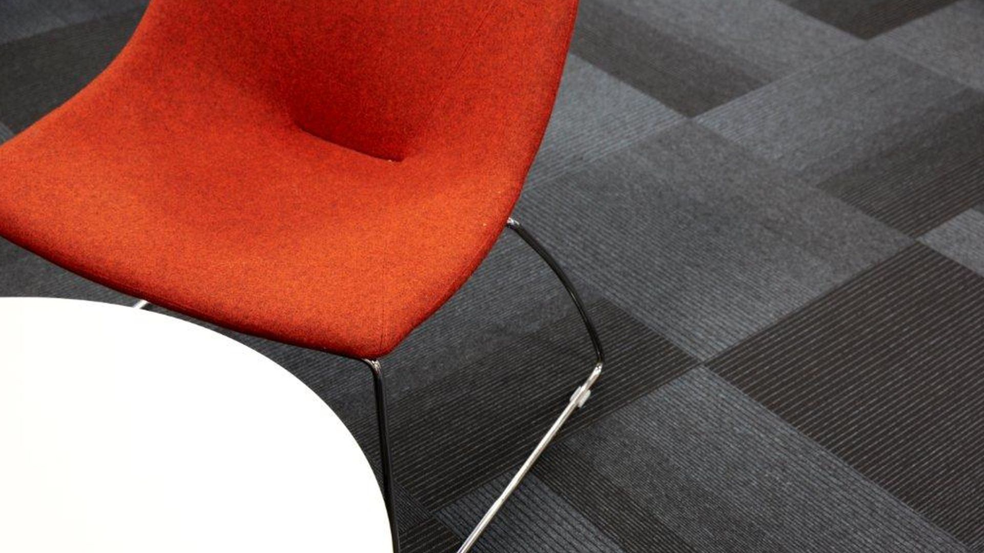
Red
Red raises a room’s energy level. It is an emotive colour that can draw people together and stimulate conversation. In an entryway, it creates a strong first impression and has been shown to raise blood pressure and heart rate. However, it can evoke feelings of rage and hostility, so it’s often best used as an accent colour rather than using it as the main colour in any room scheme.

Yellow
Yellow captures the joy of sunshine and communicates happiness. It’s perfect for office kitchens and staff rooms, where a happy colour is energising and uplifting. In receptions and hallways, yellow can feel expansive and welcoming. It is however the most fatiguing colour on the eyes, so is best used in relatively small quantities, or in spaces that are only occupied for short periods of time.

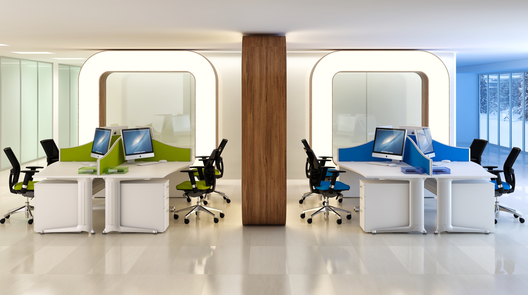
Blue
Blue and aqua hues are known to bring down blood pressure and slow respiration and heart rate. These colours are considered calming, relaxing, and serene. Be careful though as a pastel blue that’s pretty on a small sample can appear unpleasantly chilly on a wall, especially in a room that receives natural light. If you opt for a light blue as the primary colour, balance it with warm hues in the furnishing and fabrics. Avoid large expanses of dark blues however, as these can evoke feelings of sadness.

Green
Green is considered the most restful colour on the eye. Combining the refreshing quality of blue and the cheerfulness of yellow, green is suited to almost any room scheme. Dark greens can give a rich, executive feel, whereas a sage or medium green can be used to relieve stress and help people relax. This is why on tv chat shows, people wait in the ‘green room’. Beware of those office romances however as according to ancient Chinese mythology, green is believed to help with fertility.

Purple
Purple in its darkest values is rich, dramatic, and sophisticated. It’s associated with luxury and creativity, and as an accent or secondary colour, dark purple can give a scheme depth. Lighter purples, such as lavender and lilac are ideal ass office colour schemes, bringing the same restful quality to an office as blue does, but without the risk of feeling chilly.

Orange
Orange evokes excitement and is an energetic colour. It’s not ideal as a main office colour though as it can promote feelings of irritability and anxiety. As a general rule, it’s maybe best used in small quantities as an accent colour only.

Neutrals
(Black, Grey, White, and Brown) All-neutral schemes can risk looking safe, dull, and unadventurous, but their virtue lies in their flexibility: Add an accent colour to liven things up; subtract it to calm things down. Some colour experts maintain that every room needs a touch of black to ground the colour scheme and give it depth.

In summary
Our design team use colour theory (a practical combination of art and science) and over 30 years of practical experience to determine which colours will complement each other and look good together. Colour combinations can be either Complementary, Triadic, Monochromatic, Analogous, or Tetradic, and even altering shades, hues, tints and tones can create a very different ‘look and feel’.
This is a very simplified guide because there’s a lot to learn about colour – It certainly isn’t Black and White, but if you’d like to know a little more about how we can help you create a more productive and pleasant workspace, just speak to one of our office interior specialists about our friendly advice and planning service on 01302 830330.